Introduction
Online fashion shopping has become a big part of everyday life. Customers now expect more than just a list of
products. They want a website that looks good, works smoothly, and makes shopping easy on any device.
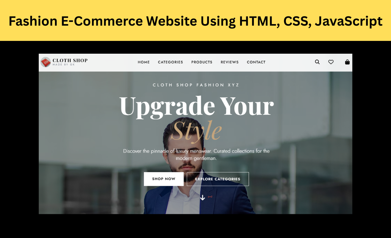
In this project, we will create a Premium Luxury Fashion E-Commerce Website using HTML, CSS, and JavaScript. The
website includes useful features like product filtering, wishlist management, shopping cart functionality,
WhatsApp ordering, recently viewed products, customer reviews, and smooth animations. Along with a modern design
and easy navigation, the website provides a professional and enjoyable shopping experience.
Before starting, make sure you know:
- Basics of HTML, CSS, and JavaScript
- Responsive Web Design
- DOM Manipulation in JavaScript
- Local Storage Basics
- How to use a code editor like VS Code
This is a beginner-friendly project, but having basic front-end knowledge will help you understand the code more easily.
Luxury Fashion Website (Source Code)
In this project, everything is built inside a single HTML file where HTML, CSS, and JavaScript are combined
together. This makes the project simple to understand and easy to run, especially for beginners.
Since all the code is available in one place, you can directly open the file in your browser and see the
complete website without any extra setup.
To create this project, you only need:
<index.html> After adding the code, simply open the file in your browser to see the fully
functional luxury fashion e-commerce website.
Features of the Project
This website includes many features that are commonly seen in modern online fashion stores. Users can browse
products, filter items by category or price, save products to a wishlist, manage their shopping cart, and even
place orders through WhatsApp.
The website also includes customer reviews, an Instagram reels showcase, recently viewed products, responsive
layouts, smooth animations, and interactive sliders to create a more engaging shopping experience.
HTML:
Let's start with the HTML structure of the fashion e-commerce website.
The project begins with the standard HTML structure using the <html>
<head> and <body> elements. External libraries such as Tailwind CSS, Font
Awesome, GSAP, and Swiper.js are included inside the head section to provide styling, icons, animations, and
sliders.
The page is divided into different sections such as the hero banner, product collection area, filter sidebar,
customer reviews section, Instagram reels showcase, contact area, and footer.
The product collection section contains a <div id="product-grid"> container where products
are displayed dynamically using JavaScript. Additional elements like the cart sidebar, wishlist modal, product
detail modal, mobile menu, and search bar are also included to provide a complete shopping experience.
<!DOCTYPE html>
<html lang="en" class="scroll-smooth">
<head>
<meta charset="UTF-8">
<meta name="viewport" content="width=device-width, initial-scale=1.0, maximum-scale=1.0, user-scalable=no">
<title>Cloth Shop | Premium Men's Wear</title>
<meta name="description"
content="Upgrade Your Style with Cloth Shop. Discover premium luxury men's clothing, shirts, t-shirts, jeans, and accessories.">
<!-- Fonts -->
<link rel="preconnect" href="https://fonts.googleapis.com">
<link rel="preconnect" href="https://fonts.gstatic.com" crossorigin>
<link
href="https://fonts.googleapis.com/css2?family=Playfair+Display:ital,wght@0,400;0,600;0,700;1,400&family=Jost:wght@300;400;500;600&display=swap"
rel="stylesheet">
<!-- Icons -->
<link rel="stylesheet" href="https://cdnjs.cloudflare.com/ajax/libs/font-awesome/6.4.0/css/all.min.css">
<!-- Swiper CSS -->
<link rel="stylesheet" href="https://cdn.jsdelivr.net/npm/swiper@10/swiper-bundle.min.css" />
<!-- Tailwind CSS -->
<script src="https://cdn.tailwindcss.com"></script>
<script>
tailwind.config = {
theme: {
extend: {
colors: {
luxury: {
black: '#0a0a0a',
white: '#ffffff',
beige: '#f5f2eb',
gold: '#c4a47c',
gray: '#f0f0f0',
darkgray: '#333333'
}
},
fontFamily: {
serif: ['Playfair Display', 'serif'],
sans: ['Jost', 'sans-serif'],
},
screens: {
'xs': '375px',
}
}
}
}
</script>
</head>
<body class="antialiased selection:bg-luxury-gold selection:text-white relative">
<!-- Toast Notification Container -->
<div id="toast-container"
class="fixed top-24 right-4 z-[60] flex flex-col gap-2 w-full max-w-[90%] sm:max-w-sm pointer-events-none">
</div>
<!-- Navigation -->
<nav id="navbar" class="fixed w-full z-40 transition-all duration-300 glass py-3 md:py-4">
<div class="container mx-auto px-4 md:px-8 flex justify-between items-center">
<!-- Mobile Menu Toggle -->
<button id="mobile-menu-btn"
class="md:hidden text-2xl focus:outline-none w-10 h-10 flex items-center justify-start text-luxury-black"
onclick="toggleMobileMenu()">
<i class="fa-solid fa-bars"></i>
</button>
<!-- Logo -->
<a href="#" class="flex items-center gap-2 absolute left-1/2 -translate-x-1/2 md:static md:translate-x-0"
onclick="scrollToTop()">
<img class="w-8 h-8 md:w-10 md:h-10 bg-luxury-black text-white rounded-full flex items-center justify-center font-serif font-bold text-lg md:text-xl tracking-wider"
src="https://images.unsplash.com/photo-1579468118864-1b9ea3c0db4a?w=1200&q=70&auto=format&fit=crop"
alt="">
<div class="hidden sm:flex flex-col">
<span class="font-serif font-bold text-lg tracking-widest uppercase leading-none">Cloth Shop</span>
<span class="text-[10px] tracking-[0.3em] uppercase text-gray-500">Made By GK</span>
</div>
</a>
<!-- Desktop Links -->
<ul class="hidden md:flex space-x-8 text-sm uppercase tracking-widest font-medium">
<li><a href="#" class="hover:text-luxury-gold transition-colors">Home</a></li>
<li><a href="#categories" class="hover:text-luxury-gold transition-colors">Categories</a></li>
<li><a href="#shop" class="hover:text-luxury-gold transition-colors">Products</a></li>
<li><a href="#reviews" class="hover:text-luxury-gold transition-colors">Reviews</a></li>
<li><a href="#contact" class="hover:text-luxury-gold transition-colors">Contact</a></li>
</ul>
<!-- Icons & Search -->
<div class="flex items-center gap-3 md:gap-6">
<!-- Desktop Search Bar -->
<div class="relative hidden sm:block group">
<input type="text" id="global-search" placeholder="Search products..."
class="w-0 group-hover:w-48 focus:w-48 transition-all duration-300 bg-transparent border-b border-gray-300 focus:border-luxury-black outline-none py-1 text-sm pb-1 px-2 opacity-0 group-hover:opacity-100 focus:opacity-100 placeholder-gray-400">
<button
class="absolute right-0 top-1/2 -translate-y-1/2 text-lg hover:text-luxury-gold transition-colors"
aria-label="Search">
<i class="fa-solid fa-magnifying-glass"></i>
</button>
</div>
<!-- Mobile Search Toggle -->
<button
class="sm:hidden text-xl w-10 h-10 flex items-center justify-center hover:text-luxury-gold transition-colors"
onclick="toggleMobileSearch()" aria-label="Search">
<i class="fa-solid fa-magnifying-glass"></i>
</button>
<!-- Wishlist Icon -->
<button onclick="toggleWishlist()"
class="relative text-xl w-10 h-10 flex items-center justify-center hover:text-luxury-gold transition-colors"
aria-label="Wishlist">
<i class="fa-regular fa-heart"></i>
<span id="wishlist-count"
class="absolute top-1 right-1 bg-luxury-gold text-white text-[10px] w-4 h-4 rounded-full flex items-center justify-center font-bold shadow-sm hidden">0</span>
</button>
<!-- Cart Icon -->
<button onclick="toggleCart()"
class="relative text-xl w-10 h-10 flex items-center justify-center hover:text-luxury-gold transition-colors"
aria-label="Cart">
<i class="fa-solid fa-bag-shopping"></i>
<span id="cart-count"
class="absolute top-1 right-1 bg-luxury-black text-white text-[10px] w-4 h-4 rounded-full flex items-center justify-center font-bold shadow-sm hidden">0</span>
</button>
</div>
</div>
<!-- Expandable Mobile Search Bar -->
<div id="mobile-search-bar"
class="search-expand absolute top-full left-0 w-full bg-white px-4 shadow-md sm:hidden z-30">
<div class="relative">
<input type="text" id="mobile-search-input" placeholder="Search for shirts, jeans..."
class="w-full bg-gray-100 rounded-full py-3 px-5 pr-12 outline-none text-sm focus:ring-1 focus:ring-luxury-gold">
<i class="fa-solid fa-magnifying-glass absolute right-4 top-1/2 -translate-y-1/2 text-gray-400"></i>
</div>
</div>
</nav>
<!-- Mobile Slide Menu -->
<div id="mobile-menu-overlay"
class="fixed inset-0 bg-black/50 z-[45] hidden opacity-0 transition-opacity duration-300"
onclick="toggleMobileMenu()"></div>
<div id="mobile-menu"
class="fixed top-0 left-0 h-full w-[80%] max-w-[320px] bg-white z-[50] transform -translate-x-full transition-transform duration-300 ease-in-out flex flex-col shadow-2xl">
<div class="p-6 border-b flex justify-between items-center bg-luxury-beige">
<div class="flex items-center gap-2">
<div
class="w-8 h-8 bg-luxury-black text-white rounded-full flex items-center justify-center font-serif font-bold text-lg">
S</div>
<span class="font-serif font-bold uppercase tracking-widest text-sm">Menu</span>
</div>
<button onclick="toggleMobileMenu()"
class="text-2xl w-10 h-10 flex items-center justify-end hover:text-luxury-gold transition"><i
class="fa-solid fa-xmark"></i></button>
</div>
<ul class="flex flex-col p-6 space-y-6 text-xl font-serif overflow-y-auto">
<li><a href="#" class="mobile-link block hover:text-luxury-gold border-b border-gray-100 pb-2">Home</a></li>
<li><a href="#categories"
class="mobile-link block hover:text-luxury-gold border-b border-gray-100 pb-2">Categories</a></li>
<li><a href="#shop"
class="mobile-link block hover:text-luxury-gold border-b border-gray-100 pb-2">Products</a></li>
<li><a href="#reviews"
class="mobile-link block hover:text-luxury-gold border-b border-gray-100 pb-2">Reviews</a></li>
<li><a href="#reels"
class="mobile-link block hover:text-luxury-gold border-b border-gray-100 pb-2">Instagram</a></li>
<li><a href="#contact" class="mobile-link block hover:text-luxury-gold pb-2">Contact</a></li>
</ul>
<div class="mt-auto p-6 bg-gray-50 border-t">
<div class="flex space-x-4">
<a href="#"
class="w-10 h-10 rounded-full bg-white shadow flex items-center justify-center text-luxury-black hover:text-luxury-gold"><i
class="fa-brands fa-instagram"></i></a>
<a href="#"
class="w-10 h-10 rounded-full bg-white shadow flex items-center justify-center text-luxury-black hover:text-luxury-gold"><i
class="fa-brands fa-whatsapp"></i></a>
</div>
</div>
</div>
<!-- Cart Sidebar -->
<div id="cart-overlay" class="fixed inset-0 bg-black/50 z-[55] hidden opacity-0 transition-opacity duration-300"
onclick="toggleCart()"></div>
<div id="cart-sidebar"
class="fixed top-0 right-0 h-full w-full sm:w-[400px] bg-white z-[60] transform translate-x-full transition-transform duration-300 ease-in-out flex flex-col shadow-2xl">
<div class="p-4 md:p-6 border-b flex justify-between items-center bg-luxury-beige">
<h2 class="font-serif text-xl md:text-2xl font-semibold">Your Cart</h2>
<button onclick="toggleCart()"
class="text-2xl w-10 h-10 flex items-center justify-end hover:text-luxury-gold transition"><i
class="fa-solid fa-xmark"></i></button>
</div>
<div id="cart-items" class="flex-1 overflow-y-auto p-4 md:p-6 space-y-4 md:space-y-6 no-scrollbar">
<!-- Cart Items Injected Here -->
<div class="text-center text-gray-500 mt-10">Your cart is empty.</div>
</div>
<div class="p-4 md:p-6 border-t bg-gray-50">
<div class="flex justify-between items-center mb-4 text-lg font-semibold font-serif">
<span>Subtotal</span>
<span id="cart-total">₹0</span>
</div>
<p class="text-xs text-gray-500 mb-4">Taxes and shipping calculated at checkout</p>
<button onclick="orderViaWhatsApp()"
class="w-full bg-[#25D366] hover:bg-[#128C7E] text-white py-4 flex justify-center items-center gap-2 uppercase tracking-widest text-sm font-semibold transition-colors rounded">
<i class="fa-brands fa-whatsapp text-xl"></i> Order on WhatsApp
</button>
</div>
</div>
<!-- Wishlist Modal -->
<div id="wishlist-overlay" class="fixed inset-0 bg-black/50 z-[55] hidden opacity-0 transition-opacity duration-300"
onclick="toggleWishlist()"></div>
<div id="wishlist-modal"
class="fixed top-0 left-0 w-full h-full md:top-1/2 md:left-1/2 md:-translate-x-1/2 md:-translate-y-1/2 md:w-[90%] md:max-w-[1000px] md:h-auto md:max-h-[85vh] bg-white z-[60] hidden flex-col shadow-2xl md:rounded-lg overflow-hidden transform md:scale-95 opacity-0 transition-all duration-300 translate-y-full md:translate-y-0">
<div class="p-4 md:p-6 border-b flex justify-between items-center sticky top-0 bg-white z-10">
<h2 class="font-serif text-2xl md:text-3xl font-semibold">Your Wishlist</h2>
<button onclick="toggleWishlist()"
class="text-2xl w-10 h-10 flex items-center justify-end hover:text-luxury-gold transition"><i
class="fa-solid fa-xmark"></i></button>
</div>
<div id="wishlist-items"
class="flex-1 overflow-y-auto p-4 md:p-6 grid grid-cols-2 lg:grid-cols-4 gap-4 md:gap-6">
<!-- Wishlist Items Injected Here -->
</div>
</div>
<!-- Product Details Modal (Full Screen Overlay) -->
<div id="product-detail-modal"
class="fixed inset-0 bg-white z-[60] hidden overflow-y-auto transform translate-y-full transition-transform duration-300">
<button onclick="closeProductModal()"
class="fixed top-4 right-4 md:top-8 md:right-10 text-2xl z-20 w-10 h-10 md:w-12 md:h-12 bg-white rounded-full flex items-center justify-center shadow-md hover:text-luxury-gold transition"><i
class="fa-solid fa-xmark"></i></button>
<div class="max-w-7xl mx-auto px-4 sm:px-6 md:px-8 py-16 md:py-24" id="product-detail-content">
<!-- Dynamic Content Injected Here -->
</div>
</div>
<!-- MAIN CONTENT -->
<main>
<!-- Hero Section -->
<section id="hero" class="relative h-[100svh] min-h-[500px] flex items-center justify-center overflow-hidden">
<!-- Background Image -->
<div class="absolute inset-0 z-0">
<img src="https://images.unsplash.com/photo-1617137968427-85924c800a22?q=80&w=2000&auto=format&fit=crop"
alt="Premium Men's Fashion"
class="w-full h-full object-cover object-center md:object-top filter brightness-[0.6]">
</div>
<div
class="relative z-10 text-center text-white px-4 w-full max-w-5xl mx-auto flex flex-col items-center mt-12 md:mt-0">
<span
class="text-xs xs:text-sm md:text-base tracking-[0.3em] md:tracking-[0.4em] uppercase mb-3 md:mb-4 opacity-0 hero-el">Cloth
Shop
Fashion xyz</span>
<h1
class="text-4xl xs:text-5xl sm:text-6xl md:text-7xl lg:text-8xl font-serif font-bold mb-4 md:mb-6 leading-tight opacity-0 hero-el px-2">
Upgrade Your <br class="hidden xs:block"> <span
class="text-luxury-gold italic font-normal">Style</span>
</h1>
<p class="text-sm xs:text-base md:text-xl font-light mb-8 md:mb-10 max-w-2xl px-4 opacity-0 hero-el">
Discover the pinnacle of luxury menswear. Curated collections for the modern gentleman.</p>
<div class="flex flex-col sm:flex-row gap-3 w-full sm:w-auto px-4 xs:px-8 sm:px-0 opacity-0 hero-el">
<a href="#shop"
class="bg-white text-luxury-black px-6 py-4 xs:px-8 w-full sm:w-auto uppercase tracking-widest text-xs md:text-sm font-semibold hover:bg-luxury-gold hover:text-white transition-colors duration-300 text-center">Shop
Now</a>
<a href="#categories"
class="border border-white text-white px-6 py-4 xs:px-8 w-full sm:w-auto uppercase tracking-widest text-xs md:text-sm font-semibold hover:bg-white hover:text-luxury-black transition-colors duration-300 text-center">Explore
Categories</a>
</div>
</div>
<!-- Scroll Indicator -->
<a href="#categories"
class="absolute bottom-6 md:bottom-8 left-1/2 -translate-x-1/2 text-white animate-bounce opacity-0 hero-el z-20 w-12 h-12 flex items-center justify-center">
<i class="fa-solid fa-arrow-down text-xl md:text-2xl"></i>
</a>
</section>
<!-- Categories Section -->
<section id="categories" class="py-16 md:py-24 bg-luxury-beige">
<div class="container mx-auto px-4 md:px-8 max-w-7xl">
<div class="text-center mb-10 md:mb-16 section-header">
<h2 class="text-3xl md:text-5xl font-serif font-bold mb-3 md:mb-4">Curated Collections</h2>
<div class="w-12 md:w-16 h-1 bg-luxury-gold mx-auto"></div>
</div>
<div class="grid grid-cols-1 sm:grid-cols-2 lg:grid-cols-4 gap-4 md:gap-6">
<!-- Category 1 -->
<div class="group relative h-[350px] md:h-[500px] overflow-hidden cursor-pointer category-card rounded-lg sm:rounded-none"
onclick="filterByCategory('Shirts')">
<img src="https://plus.unsplash.com/premium_photo-1683140435505-afb6f1738d11?w=500&auto=format&fit=crop&q=60&ixlib=rb-4.1.0&ixid=M3wxMjA3fDB8MHxzZWFyY2h8MXx8c3VtbWVyJTIwb3V0Zml0fGVufDB8fDB8fHww"
alt="Shirts"
class="w-full h-full object-cover transition-transform duration-700 group-hover:scale-110">
<div
class="absolute inset-0 bg-gradient-to-t from-black/80 via-black/20 to-transparent flex flex-col justify-end p-6 md:p-8 transition-opacity">
<h3 class="text-white font-serif text-2xl md:text-3xl mb-1 md:mb-2">Premium Shirts</h3>
<span
class="text-luxury-gold uppercase tracking-widest text-xs md:text-sm font-semibold group-hover:text-white transition-colors flex items-center gap-2">Explore
<i
class="fa-solid fa-arrow-right-long transform group-hover:translate-x-2 transition-transform"></i></span>
</div>
</div>
<!-- Category 2 -->
<div class="group relative h-[350px] md:h-[500px] overflow-hidden cursor-pointer category-card rounded-lg sm:rounded-none"
onclick="filterByCategory('T-Shirts')">
<img src="https://images.unsplash.com/photo-1521572163474-6864f9cf17ab?q=80&w=600&auto=format&fit=crop"
alt="T-Shirts"
class="w-full h-full object-cover transition-transform duration-700 group-hover:scale-110">
<div
class="absolute inset-0 bg-gradient-to-t from-black/80 via-black/20 to-transparent flex flex-col justify-end p-6 md:p-8">
<h3 class="text-white font-serif text-2xl md:text-3xl mb-1 md:mb-2">Luxury T-Shirts</h3>
<span
class="text-luxury-gold uppercase tracking-widest text-xs md:text-sm font-semibold group-hover:text-white transition-colors flex items-center gap-2">Explore
<i
class="fa-solid fa-arrow-right-long transform group-hover:translate-x-2 transition-transform"></i></span>
</div>
</div>
<!-- Category 3 -->
<div class="group relative h-[350px] md:h-[500px] overflow-hidden cursor-pointer category-card rounded-lg sm:rounded-none"
onclick="filterByCategory('Jeans')">
<img src="https://images.unsplash.com/photo-1542272604-787c3835535d?q=80&w=600&auto=format&fit=crop"
alt="Jeans"
class="w-full h-full object-cover transition-transform duration-700 group-hover:scale-110">
<div
class="absolute inset-0 bg-gradient-to-t from-black/80 via-black/20 to-transparent flex flex-col justify-end p-6 md:p-8">
<h3 class="text-white font-serif text-2xl md:text-3xl mb-1 md:mb-2">Denim Jeans</h3>
<span
class="text-luxury-gold uppercase tracking-widest text-xs md:text-sm font-semibold group-hover:text-white transition-colors flex items-center gap-2">Explore
<i
class="fa-solid fa-arrow-right-long transform group-hover:translate-x-2 transition-transform"></i></span>
</div>
</div>
<!-- Category 4 -->
<div class="group relative h-[350px] md:h-[500px] overflow-hidden cursor-pointer category-card rounded-lg sm:rounded-none"
onclick="filterByCategory('Pants')">
<img src="https://images.unsplash.com/photo-1624378439575-d8705ad7ae80?q=80&w=600&auto=format&fit=crop"
alt="Pants"
class="w-full h-full object-cover transition-transform duration-700 group-hover:scale-110">
<div
class="absolute inset-0 bg-gradient-to-t from-black/80 via-black/20 to-transparent flex flex-col justify-end p-6 md:p-8">
<h3 class="text-white font-serif text-2xl md:text-3xl mb-1 md:mb-2">Chinos & Pants</h3>
<span
class="text-luxury-gold uppercase tracking-widest text-xs md:text-sm font-semibold group-hover:text-white transition-colors flex items-center gap-2">Explore
<i
class="fa-solid fa-arrow-right-long transform group-hover:translate-x-2 transition-transform"></i></span>
</div>
</div>
</div>
</div>
</section>
<!-- Main Shop / Product Grid Section -->
<section id="shop" class="py-16 md:py-24 bg-white relative">
<div class="container mx-auto px-4 md:px-8 max-w-[1440px]">
<div class="text-center mb-10 md:mb-16 section-header">
<h2 class="text-3xl md:text-5xl font-serif font-bold mb-3 md:mb-4">The Collection</h2>
<p class="text-sm md:text-base text-gray-500 max-w-2xl mx-auto px-4">Explore our exclusive range of
meticulously crafted menswear, designed for elegance and comfort.</p>
</div>
<div class="flex flex-col lg:flex-row gap-8 lg:gap-10">
<!-- Mobile Filter Toggle -->
<div class="lg:hidden w-full">
<button onclick="toggleMobileFilters()"
class="w-full border border-gray-300 py-3 uppercase tracking-widest text-xs font-semibold flex items-center justify-center gap-2 bg-gray-50">
<i class="fa-solid fa-sliders"></i> <span id="filter-btn-text">Show Filters</span>
</button>
</div>
<!-- Filters Sidebar -->
<aside id="filters-sidebar"
class="hidden lg:block w-full lg:w-1/4 xl:w-1/5 shrink-0 bg-white md:bg-transparent transition-all duration-300">
<div class="sticky top-24 bg-luxury-beige p-6 rounded-lg md:rounded border border-gray-100">
<div class="flex justify-between items-center mb-6 border-b pb-2">
<h3 class="font-serif text-xl md:text-2xl font-bold">Filter By</h3>
<button onclick="resetFilters()"
class="text-xs uppercase tracking-widest text-gray-500 hover:text-black">Reset</button>
</div>
<!-- Category Filter -->
<div class="mb-8">
<h4 class="font-semibold uppercase tracking-wider text-xs md:text-sm mb-4">Categories
</h4>
<div class="space-y-3" id="category-filters">
<div class="flex items-center">
<input type="radio" id="cat-all" name="category" value="All"
class="hidden filter-radio" checked onchange="applyFilters()">
<label for="cat-all"
class="cursor-pointer text-sm md:text-base text-gray-600 hover:text-black transition-colors flex items-center gap-3">
<span
class="w-4 h-4 border border-gray-400 rounded-full flex items-center justify-center radio-indicator"></span>
All Products
</label>
</div>
<div class="flex items-center">
<input type="radio" id="cat-shirts" name="category" value="Shirts"
class="hidden filter-radio" onchange="applyFilters()">
<label for="cat-shirts"
class="cursor-pointer text-sm md:text-base text-gray-600 hover:text-black transition-colors flex items-center gap-3">
<span
class="w-4 h-4 border border-gray-400 rounded-full flex items-center justify-center radio-indicator"></span>
Shirts
</label>
</div>
<div class="flex items-center">
<input type="radio" id="cat-tshirts" name="category" value="T-Shirts"
class="hidden filter-radio" onchange="applyFilters()">
<label for="cat-tshirts"
class="cursor-pointer text-sm md:text-base text-gray-600 hover:text-black transition-colors flex items-center gap-3">
<span
class="w-4 h-4 border border-gray-400 rounded-full flex items-center justify-center radio-indicator"></span>
T-Shirts
</label>
</div>
<div class="flex items-center">
<input type="radio" id="cat-jeans" name="category" value="Jeans"
class="hidden filter-radio" onchange="applyFilters()">
<label for="cat-jeans"
class="cursor-pointer text-sm md:text-base text-gray-600 hover:text-black transition-colors flex items-center gap-3">
<span
class="w-4 h-4 border border-gray-400 rounded-full flex items-center justify-center radio-indicator"></span>
Jeans
</label>
</div>
<div class="flex items-center">
<input type="radio" id="cat-pants" name="category" value="Pants"
class="hidden filter-radio" onchange="applyFilters()">
<label for="cat-pants"
class="cursor-pointer text-sm md:text-base text-gray-600 hover:text-black transition-colors flex items-center gap-3">
<span
class="w-4 h-4 border border-gray-400 rounded-full flex items-center justify-center radio-indicator"></span>
Pants
</label>
</div>
</div>
</div>
<!-- Price Filter -->
<div class="mb-4">
<h4 class="font-semibold uppercase tracking-wider text-xs md:text-sm mb-4">Price Range
</h4>
<input type="range" id="price-range" min="0" max="5000" step="100" value="5000"
class="w-full accent-luxury-black" oninput="updatePriceLabel(); applyFilters()">
<div class="flex justify-between text-xs md:text-sm text-gray-600 mt-2">
<span>₹0</span>
<span id="price-label">₹5000</span>
</div>
</div>
<!-- Mobile Apply Button -->
<button
class="lg:hidden w-full bg-luxury-black text-white py-3 mt-6 uppercase tracking-widest text-xs font-semibold"
onclick="toggleMobileFilters()">
Apply Filters
</button>
</div>
</aside>
<!-- Product Grid -->
<div class="w-full lg:w-3/4 xl:w-4/5">
<div id="active-filter-label"
class="mb-4 md:mb-6 text-xs md:text-sm text-gray-500 uppercase tracking-widest hidden text-center md:text-left">
Showing results for: <span class="font-bold text-black" id="search-term-display"></span>
</div>
<!-- Responsive Grid Classes: 1 on mobile, 2 on tablet (sm), 3 on desktop (lg), 4 on large desktop (xl) -->
<div id="product-grid"
class="grid grid-cols-1 sm:grid-cols-2 lg:grid-cols-3 xl:grid-cols-4 gap-6 sm:gap-4 lg:gap-6 xl:gap-8">
<!-- Products Injected Here -->
</div>
<div id="no-products" class="hidden text-center py-10 md:py-20 px-4">
<i class="fa-solid fa-box-open text-4xl md:text-6xl text-gray-300 mb-4"></i>
<h3 class="text-xl md:text-2xl font-serif">No products found</h3>
<p class="text-sm md:text-base text-gray-500 mt-2">Try adjusting your filters or search
term.</p>
<button onclick="resetFilters()"
class="mt-6 border border-black px-6 py-3 uppercase tracking-widest text-xs md:text-sm hover:bg-black hover:text-white transition">Reset
Filters</button>
</div>
</div>
</div>
</div>
</section>
<!-- Recently Viewed Section -->
<section id="recently-viewed-section" class="py-12 md:py-16 bg-luxury-beige hidden">
<div class="container mx-auto px-4 md:px-8 max-w-7xl">
<h2 class="text-2xl md:text-3xl font-serif font-bold mb-6 md:mb-8 text-center">Recently Viewed</h2>
<div id="recently-viewed-grid"
class="grid grid-cols-2 sm:grid-cols-3 md:grid-cols-4 lg:grid-cols-5 gap-3 md:gap-4">
<!-- Items Injected -->
</div>
</div>
</section>
<!-- Instagram Reels Section -->
<section id="reels" class="py-16 md:py-24 bg-luxury-black text-white overflow-hidden">
<div class="container mx-auto px-0 md:px-8 max-w-7xl">
<div class="flex justify-between items-end mb-8 md:mb-12 section-header px-4 md:px-0">
<div>
<h2 class="text-3xl md:text-5xl font-serif font-bold mb-2">Style in Motion</h2>
<p class="text-sm md:text-base text-gray-400 font-light">Follow us on Instagram <a
href="https://www.instagram.com/Cloth Shop_fashion_xyz" class="text-luxury-gold">@Cloth
Shop_fashion</a></p>
</div>
<a href="https://www.instagram.com/Cloth Shop_fashion_xyz"
class="hidden md:flex items-center gap-2 border border-white/30 px-6 py-2 rounded-full hover:bg-white hover:text-black transition-colors text-sm">
<i class="fa-brands fa-instagram text-xl"></i> Follow Us
</a>
</div>
<!-- Swiper -->
<div class="swiper reels-slider h-[400px] sm:h-[450px] md:h-[600px] w-full px-4 md:px-0">
<div class="swiper-wrapper">
<!-- Reels Slide Function generates HTML directly from array -> hardcoded for template here -->
<div
class="swiper-slide w-[220px] xs:w-[250px] md:w-[320px] rounded-xl overflow-hidden relative group cursor-pointer">
<video src="Video-296.mp4" class="w-full h-full object-cover" autoplay muted loop
playsinline></video>
<div
class="absolute inset-0 bg-black/20 group-hover:bg-black/40 transition-colors flex items-center justify-center">
<!-- <div
class="w-12 h-12 md:w-14 md:h-14 rounded-full bg-white/30 backdrop-blur-sm flex items-center justify-center group-hover:scale-110 transition-transform">
<i class="fa-solid fa-play text-white text-lg md:text-xl ml-1"></i>
</div> -->
</div>
<div class="absolute bottom-4 left-4 flex items-center gap-2">
<i class="fa-solid fa-heart text-white"></i> <span
class="text-white text-xs md:text-sm font-semibold">16.4k</span>
</div>
</div>
<div
class="swiper-slide w-[220px] xs:w-[250px] md:w-[320px] rounded-xl overflow-hidden relative group cursor-pointer">
<video src="Video-455.mp4" class="w-full h-full object-cover" autoplay muted loop
playsinline></video>
<div
class="absolute inset-0 bg-black/20 group-hover:bg-black/40 transition-colors flex items-center justify-center">
<!-- <div
class="w-12 h-12 md:w-14 md:h-14 rounded-full bg-white/30 backdrop-blur-sm flex items-center justify-center group-hover:scale-110 transition-transform">
<i class="fa-solid fa-play text-white text-lg md:text-xl ml-1"></i>
</div> -->
</div>
<div class="absolute bottom-4 left-4 flex items-center gap-2">
<i class="fa-solid fa-heart text-white"></i> <span
class="text-white text-xs md:text-sm font-semibold">12.4k</span>
</div>
</div>
<div
class="swiper-slide w-[220px] xs:w-[250px] md:w-[320px] rounded-xl overflow-hidden relative group cursor-pointer">
<video src="Video-599.mp4" class="w-full h-full object-cover" autoplay muted loop
playsinline></video>
<div
class="absolute inset-0 bg-black/20 group-hover:bg-black/40 transition-colors flex items-center justify-center">
<!-- <div
class="w-12 h-12 md:w-14 md:h-14 rounded-full bg-white/30 backdrop-blur-sm flex items-center justify-center group-hover:scale-110 transition-transform">
<i class="fa-solid fa-play text-white text-lg md:text-xl ml-1"></i>
</div> -->
</div>
<div class="absolute bottom-4 left-4 flex items-center gap-2">
<i class="fa-solid fa-heart text-white"></i> <span
class="text-white text-xs md:text-sm font-semibold">20.4k</span>
</div>
</div>
<div
class="swiper-slide w-[220px] xs:w-[250px] md:w-[320px] rounded-xl overflow-hidden relative group cursor-pointer">
<video src="Video-940.mp4" class="w-full h-full object-cover" autoplay muted loop
playsinline></video>
<div
class="absolute inset-0 bg-black/20 group-hover:bg-black/40 transition-colors flex items-center justify-center">
<!-- <div
class="w-12 h-12 md:w-14 md:h-14 rounded-full bg-white/30 backdrop-blur-sm flex items-center justify-center group-hover:scale-110 transition-transform">
<i class="fa-solid fa-play text-white text-lg md:text-xl ml-1"></i>
</div> -->
</div>
<div class="absolute bottom-4 left-4 flex items-center gap-2">
<i class="fa-solid fa-heart text-white"></i> <span
class="text-white text-xs md:text-sm font-semibold">92.4k</span>
</div>
</div>
</div>
</div>
<div class="mt-8 text-center md:hidden px-4">
<a href="https://www.instagram.com/Cloth Shop_fashion_xyz"
class="inline-flex items-center justify-center w-full gap-2 border border-white/30 px-6 py-3 rounded-full hover:bg-white hover:text-black transition-colors text-sm">
<i class="fa-brands fa-instagram text-xl"></i> Follow on Instagram
</a>
</div>
</div>
</section>
<!-- Reviews Section -->
<section id="reviews" class="py-16 md:py-24 bg-white">
<div class="container mx-auto px-4 md:px-8 max-w-7xl">
<div class="text-center mb-10 md:mb-16 section-header">
<h2 class="text-3xl md:text-5xl font-serif font-bold mb-3 md:mb-4">Client Elegance</h2>
<p class="text-sm md:text-base text-gray-500">What our gentlemen say about our collection.</p>
</div>
<div class="swiper reviews-slider pb-12">
<div class="swiper-wrapper">
<!-- Review 1 -->
<div
class="swiper-slide p-6 md:p-8 bg-luxury-beige rounded-lg border border-gray-100 relative h-auto">
<i
class="fa-solid fa-quote-right absolute top-4 right-4 md:top-6 md:right-8 text-3xl md:text-4xl text-luxury-gold/20"></i>
<div class="flex text-luxury-gold mb-4 text-xs md:text-sm">
<i class="fa-solid fa-star"></i><i class="fa-solid fa-star"></i><i
class="fa-solid fa-star"></i><i class="fa-solid fa-star"></i><i
class="fa-solid fa-star"></i>
</div>
<p class="font-serif text-base md:text-lg italic mb-6">"The fitting of the shirts is
absolutely impeccable. It feels like bespoke tailoring. Cloth Shop has become my go-to
for luxury wear."</p>
<div class="flex items-center gap-3 md:gap-4 mt-auto">
<img src="https://randomuser.me/api/portraits/men/32.jpg" alt="Rahul S."
class="w-10 h-10 md:w-12 md:h-12 rounded-full object-cover">
<div>
<h4 class="font-bold text-sm md:text-base">Rahul Sharma</h4>
<span class="text-[10px] md:text-xs text-gray-500">Verified Buyer</span>
</div>
</div>
</div>
<!-- Review 2 -->
<div
class="swiper-slide p-6 md:p-8 bg-luxury-beige rounded-lg border border-gray-100 relative h-auto">
<i
class="fa-solid fa-quote-right absolute top-4 right-4 md:top-6 md:right-8 text-3xl md:text-4xl text-luxury-gold/20"></i>
<div class="flex text-luxury-gold mb-4 text-xs md:text-sm">
<i class="fa-solid fa-star"></i><i class="fa-solid fa-star"></i><i
class="fa-solid fa-star"></i><i class="fa-solid fa-star"></i><i
class="fa-solid fa-star-half-stroke"></i>
</div>
<p class="font-serif text-base md:text-lg italic mb-6">"Bought a pair of denim and a blazer.
The quality is simply outstanding. The fabric is breathable and clearly premium."</p>
<div class="flex items-center gap-3 md:gap-4 mt-auto">
<img src="https://randomuser.me/api/portraits/men/44.jpg" alt="Vikram S."
class="w-10 h-10 md:w-12 md:h-12 rounded-full object-cover">
<div>
<h4 class="font-bold text-sm md:text-base">Vikram Singh</h4>
<span class="text-[10px] md:text-xs text-gray-500">Verified Buyer</span>
</div>
</div>
</div>
<!-- Review 3 -->
<div
class="swiper-slide p-6 md:p-8 bg-luxury-beige rounded-lg border border-gray-100 relative h-auto">
<i
class="fa-solid fa-quote-right absolute top-4 right-4 md:top-6 md:right-8 text-3xl md:text-4xl text-luxury-gold/20"></i>
<div class="flex text-luxury-gold mb-4 text-xs md:text-sm">
<i class="fa-solid fa-star"></i><i class="fa-solid fa-star"></i><i
class="fa-solid fa-star"></i><i class="fa-solid fa-star"></i><i
class="fa-solid fa-star"></i>
</div>
<p class="font-serif text-base md:text-lg italic mb-6">"Exceptional customer service and
beautiful packaging. Ordering on WhatsApp was seamless. The Chinos fit perfectly."</p>
<div class="flex items-center gap-3 md:gap-4 mt-auto">
<img src="https://randomuser.me/api/portraits/men/22.jpg" alt="Aditya K."
class="w-10 h-10 md:w-12 md:h-12 rounded-full object-cover">
<div>
<h4 class="font-bold text-sm md:text-base">Aditya Kumar</h4>
<span class="text-[10px] md:text-xs text-gray-500">Verified Buyer</span>
</div>
</div>
</div>
</div>
<div class="swiper-pagination mt-6 md:mt-8"></div>
</div>
</div>
</section>
<!-- Contact Section -->
<section id="contact" class="py-0 relative">
<div class="flex flex-col-reverse lg:flex-row">
<!-- Map -->
<div class="w-full lg:w-1/2 h-[300px] md:h-[400px] lg:h-[600px] bg-gray-200">
<iframe
src="https://www.google.com/maps/embed?pb=!1m18!1m12!1m3!1d115206.57012351475!2d72.77526737525287!3d24.877864356494195!2m3!1f0!2f0!3f0!3m2!1i1024!2i768!4f13.1!3m3!1m2!1s0x3942ceb7f14b3017%3A0x64b0fce571113bba!2sxyz%2C%20Rajasthan%20307001!5e0!3m2!1sen!2sin!4v1709555123456!5m2!1sen!2sin"
width="100%" height="100%" style="border:0;" allowfullscreen="" loading="lazy"
referrerpolicy="no-referrer-when-downgrade"></iframe>
</div>
<!-- Info -->
<div
class="w-full lg:w-1/2 bg-luxury-black text-white p-8 sm:p-12 md:p-16 lg:p-24 flex flex-col justify-center">
<span
class="text-luxury-gold tracking-[0.2em] md:tracking-[0.3em] uppercase text-xs md:text-sm mb-3 md:mb-4">Visit
Our Boutique</span>
<h2 class="text-3xl sm:text-4xl md:text-5xl font-serif mb-8 md:mb-10 leading-tight">Experience
Luxury <br class="hidden sm:block">In Person.</h2>
<div class="space-y-6 md:space-y-8">
<div class="flex items-start gap-3 md:gap-4">
<i class="fa-solid fa-location-dot text-luxury-gold text-lg md:text-xl mt-1"></i>
<div>
<h4 class="font-bold text-base md:text-lg mb-1">Store Address</h4>
<p class="text-gray-400 font-light text-sm md:text-base">Cloth Shop Fashion, Main
Market,<br>xyz, Rajasthan 307001, India</p>
</div>
</div>
<div class="flex items-start gap-3 md:gap-4">
<i class="fa-solid fa-clock text-luxury-gold text-lg md:text-xl mt-1"></i>
<div>
<h4 class="font-bold text-base md:text-lg mb-1">Opening Hours</h4>
<p class="text-gray-400 font-light text-sm md:text-base">Monday - Saturday: 10:00 AM -
8:30 PM<br>Sunday: Closed</p>
</div>
</div>
<div class="flex items-start gap-3 md:gap-4">
<i class="fa-solid fa-phone text-luxury-gold text-lg md:text-xl mt-1"></i>
<div>
<h4 class="font-bold text-base md:text-lg mb-1">Contact</h4>
<p class="text-gray-400 font-light text-sm md:text-base">+91 4512857777<br>contact@Cloth
Shopfashion.com</p>
</div>
</div>
</div>
</div>
</div>
</section>
</main>
<!-- Footer -->
<footer class="bg-[#050505] text-white pt-16 md:pt-20 pb-8 md:pb-10 border-t border-white/10">
<div class="container mx-auto px-4 md:px-8 max-w-7xl">
<div class="grid grid-cols-1 sm:grid-cols-2 lg:grid-cols-4 gap-10 md:gap-12 mb-12 md:mb-16">
<!-- Brand -->
<div>
<div class="flex items-center gap-2 mb-6">
<div
class="w-8 h-8 md:w-10 md:h-10 bg-white text-black rounded-full flex items-center justify-center font-serif font-bold text-lg md:text-xl tracking-wider">
S
</div>
<div class="flex flex-col">
<span
class="font-serif font-bold text-base md:text-lg tracking-widest uppercase leading-none">Cloth
Shop</span>
</div>
</div>
<p class="text-gray-400 text-xs md:text-sm leading-relaxed mb-6">Redefining men's luxury fashion in
xyz. Premium fabrics, tailored fits, and timeless elegance.</p>
<div class="flex space-x-4">
<a href="https://www.instagram.com/Cloth Shop_fashion_xyz"
class="w-8 h-8 md:w-10 md:h-10 rounded-full bg-white/10 flex items-center justify-center hover:bg-luxury-gold hover:text-white transition-colors text-sm md:text-base"><i
class="fa-brands fa-instagram"></i></a>
<a href="#"
class="w-8 h-8 md:w-10 md:h-10 rounded-full bg-white/10 flex items-center justify-center hover:bg-luxury-gold hover:text-white transition-colors text-sm md:text-base"><i
class="fa-brands fa-facebook-f"></i></a>
<a href="#"
class="w-8 h-8 md:w-10 md:h-10 rounded-full bg-white/10 flex items-center justify-center hover:bg-luxury-gold hover:text-white transition-colors text-sm md:text-base"><i
class="fa-brands fa-whatsapp"></i></a>
</div>
</div>
<!-- Quick Links -->
<div>
<h4 class="font-serif text-lg md:text-xl mb-4 md:mb-6">Quick Links</h4>
<ul class="space-y-2 md:space-y-3 text-xs md:text-sm text-gray-400">
<li><a href="#" class="hover:text-luxury-gold transition-colors block py-1">About Us</a></li>
<li><a href="#" class="hover:text-luxury-gold transition-colors block py-1">Our Story</a></li>
<li><a href="#" class="hover:text-luxury-gold transition-colors block py-1">Size Guide</a></li>
<li><a href="#" class="hover:text-luxury-gold transition-colors block py-1">Shipping &
Returns</a></li>
<li><a href="#" class="hover:text-luxury-gold transition-colors block py-1">Privacy Policy</a>
</li>
</ul>
</div>
<!-- Categories -->
<div>
<h4 class="font-serif text-lg md:text-xl mb-4 md:mb-6">Categories</h4>
<ul class="space-y-2 md:space-y-3 text-xs md:text-sm text-gray-400">
<li><a href="#" onclick="filterByCategory('Shirts'); return false;"
class="hover:text-luxury-gold transition-colors block py-1">Premium Shirts</a></li>
<li><a href="#" onclick="filterByCategory('T-Shirts'); return false;"
class="hover:text-luxury-gold transition-colors block py-1">Luxury T-Shirts</a></li>
<li><a href="#" onclick="filterByCategory('Jeans'); return false;"
class="hover:text-luxury-gold transition-colors block py-1">Denim Collection</a></li>
<li><a href="#" onclick="filterByCategory('Pants'); return false;"
class="hover:text-luxury-gold transition-colors block py-1">Chinos & Trousers</a></li>
<li><a href="#" onclick="filterByCategory('New Arrivals'); return false;"
class="hover:text-luxury-gold transition-colors block py-1">New Arrivals</a></li>
</ul>
</div>
<!-- Newsletter -->
<div>
<h4 class="font-serif text-lg md:text-xl mb-4 md:mb-6">Newsletter</h4>
<p class="text-gray-400 text-xs md:text-sm mb-4">Subscribe to receive updates, access to exclusive
deals, and more.</p>
<form onsubmit="event.preventDefault(); showToast('Subscribed successfully!', 'success');"
class="flex flex-col sm:flex-row w-full gap-2 sm:gap-0">
<input type="email" placeholder="Enter your email" required
class="bg-white/5 border border-white/10 px-4 py-3 sm:py-2 w-full outline-none focus:border-luxury-gold text-sm text-white rounded sm:rounded-r-none">
<button type="submit"
class="bg-luxury-gold text-white px-6 py-3 sm:py-2 hover:bg-white hover:text-black transition-colors rounded sm:rounded-l-none font-semibold text-sm">
<span class="sm:hidden uppercase tracking-wider">Subscribe</span>
<i class="fa-solid fa-arrow-right hidden sm:inline-block"></i>
</button>
</form>
</div>
</div>
<div
class="text-center text-gray-600 text-[10px] md:text-xs border-t border-white/10 pt-6 md:pt-8 mt-6 md:mt-8">
© <span id="year"></span> Cloth Shop. All Rights Reserved. Designed for Luxury.
</div>
</div>
</footer>
<!-- Scripts -->
<script src="https://cdnjs.cloudflare.com/ajax/libs/gsap/3.12.2/gsap.min.js"></script>
<script src="https://cdnjs.cloudflare.com/ajax/libs/gsap/3.12.2/ScrollTrigger.min.js"></script>
<script src="https://cdn.jsdelivr.net/npm/swiper@10/swiper-bundle.min.js"></script>
</body>
</html>
CSS:
The styling is created using Tailwind CSS utility classes along with custom CSS for additional effects and
responsiveness.
The design follows a luxury fashion theme with clean layouts, elegant typography, premium spacing, and modern
color combinations. Product cards include smooth hover effects, responsive image layouts, and stylish action
buttons.
The project uses classes like group-hover:scale-105 and transition-transform to create smooth image zoom effects
when users hover over products. Components such as the cart sidebar, mobile menu, and product modal use
translate-x-full, translate-y-full, and opacity-0 to create smooth opening and closing animations.
Effects like backdrop-blur-sm, custom shadows, glass-style elements, and responsive aspect ratios help give the
website a modern and premium appearance on both desktop and mobile devices.
            /* Custom Styles & Micro-interactions */
        body {
            font-family: 'Jost', sans-serif;
            overflow-x: hidden;
            /* Prevent horizontal scroll */
            background-color: #ffffff;
            color: #0a0a0a;
            -webkit-tap-highlight-color: transparent;
        }

        h1,
        h2,
        h3,
        h4,
        h5,
        .font-serif {
            font-family: 'Playfair Display', serif;
        }

        /* Glassmorphism */
        .glass {
            background: rgba(255, 255, 255, 0.9);
            backdrop-filter: blur(12px);
            -webkit-backdrop-filter: blur(12px);
            border-bottom: 1px solid rgba(255, 255, 255, 0.3);
        }

        /* Hide Scrollbar */
        .no-scrollbar::-webkit-scrollbar {
            display: none;
        }

        .no-scrollbar {
            -ms-overflow-style: none;
            scrollbar-width: none;
        }

        /* Product Zoom Effect - Desktop Only */
        @media (min-width: 768px) {
            .product-zoom-container {
                overflow: hidden;
                position: relative;
                cursor: zoom-in;
            }

            .product-zoom-container img {
                transition: transform 0.3s ease;
            }

            .product-zoom-container:hover img {
                transform: scale(1.5);
            }
        }

        /* Custom Checkbox/Radio */
        .filter-radio:checked+label {
            font-weight: 600;
            color: #c4a47c;
        }

        .filter-radio:checked+label .radio-indicator {
            background-color: #c4a47c;
            border-color: #c4a47c;
        }

        /* Swiper Custom Pagination */
        .swiper-pagination-bullet-active {
            background-color: #0a0a0a !important;
        }

        /* Toast Animation */
        @keyframes slideInRight {
            from {
                transform: translateX(100%);
                opacity: 0;
            }

            to {
                transform: translateX(0);
                opacity: 1;
            }
        }

        @keyframes slideOutRight {
            from {
                transform: translateX(0);
                opacity: 1;
            }

            to {
                transform: translateX(100%);
                opacity: 0;
            }
        }

        .toast-enter {
            animation: slideInRight 0.4s cubic-bezier(0.16, 1, 0.3, 1) forwards;
        }

        .toast-exit {
            animation: slideOutRight 0.4s cubic-bezier(0.16, 1, 0.3, 1) forwards;
        }

        /* Mobile Search Expand Animation */
        .search-expand {
            max-height: 0;
            overflow: hidden;
            transition: max-height 0.3s ease-out, padding 0.3s ease-out;
        }

        .search-expand.active {
            max-height: 80px;
            padding-top: 1rem;
            padding-bottom: 1rem;
            border-bottom: 1px solid #f0f0f0;
        }
JavaScript:
The functionality of the website is handled using JavaScript.
This is where the website becomes truly interactive. Instead of showing static products, JavaScript helps users
search items, manage their cart, save products to a wishlist, and interact with different parts of the store
without refreshing the page.
A product database is stored inside an array called productsDB, where each product contains information such as
its name, category, price, rating, description, features, and images. Instead of manually writing product cards
in HTML, products are generated dynamically through JavaScript.
For example, products are displayed using: renderProducts();
The website also includes a search and filtering system. Users can search products by name, choose a category,
or set a maximum price range. Based on these selections, JavaScript updates the visible products automatically.
Shopping cart and wishlist functionality are also handled through JavaScript. Users can add products, update
quantities, remove items, and save products for later without refreshing the page. They can also open a detailed
product modal, switch between product images, and view recently explored products without leaving the page.
To keep user data available after page refreshes, Local Storage is used:
localStorage.setItem('sf_cart', JSON.stringify(cart));
localStorage.setItem('sf_wishlist', JSON.stringify(wishlist));
The project also includes WhatsApp ordering. When users click the Buy Now button, JavaScript generates a product
message and redirects them directly to WhatsApp.
In addition, GSAP is used for smooth animations throughout the website, while Swiper.js powers the reels slider
and customer review carousel, making the overall experience more interactive and engaging.
// --- DATA / DATABASE ---
const productsDB = [
{
id: 1, name: "Oxford Cotton Classic Shirt", price: 1899, category: "Shirts", rating: 4.8, reviews: 124,
description: "Crafted from pure Oxford cotton, this classic button-down shirt offers unparalleled comfort and breathability. Tailored for a modern fit.",
features: ["100% Premium Oxford Cotton", "Tailored Modern Fit", "Wrinkle-Resistant Finish", "Machine Washable"],
images: ["https://images.unsplash.com/photo-1590086782957-93c06ef21604?w=500&auto=format&fit=crop&q=60&ixlib=rb-4.1.0&ixid=M3wxMjA3fDB8MHxzZWFyY2h8MTB8fG1hbnxlbnwwfHwwfHx8MA%3D%3D", "https://images.unsplash.com/photo-1590086782957-93c06ef21604?w=500&auto=format&fit=crop&q=60&ixlib=rb-4.1.0&ixid=M3wxMjA3fDB8MHxzZWFyY2h8MTB8fG1hbnxlbnwwfHwwfHx8MA%3D%3D"]
},
{
id: 2, name: "Midnight Silk Blend Shirt", price: 2499, category: "Shirts", rating: 5.0, reviews: 89,
description: "Make a statement with this luxurious midnight black silk-blend shirt. Soft, drape-heavy fabric for an elegant silhouette.",
features: ["Silk & Fine Cotton Blend", "Subtle Luster Finish", "Slim Fit", "Dry Clean Recommended"],
images: ["https://images.unsplash.com/photo-1603252109303-2751441dd157?q=80&w=800&auto=format&fit=crop", "https://images.unsplash.com/photo-1603252109360-909baaf261c7?q=80&w=800&auto=format&fit=crop"]
},
{
id: 3, name: "Supima Cotton V-Neck Tee", price: 899, category: "T-Shirts", rating: 4.6, reviews: 210,
description: "The ultimate everyday luxury. Made from 100% Supima cotton, this t-shirt is twice as strong and much softer than regular cotton.",
features: ["100% Supima Cotton", "V-Neck Design", "Pre-shrunk", "Tagless interior"],
images: ["https://images.unsplash.com/photo-1521572163474-6864f9cf17ab?q=80&w=800&auto=format&fit=crop", "https://images.unsplash.com/photo-1562157873-818bc0726f68?q=80&w=800&auto=format&fit=crop"]
},
{
id: 4, name: "Textured Knit Polo", price: 1499, category: "T-Shirts", rating: 4.7, reviews: 156,
description: "Elevate your casual wear with this textured knit polo. Perfect for a smart-casual weekend look.",
features: ["Premium Cotton Knit", "Ribbed Collar & Cuffs", "3-Button Placket", "Breathable Texture"],
images: ["https://images.unsplash.com/photo-1581655353564-df123a1eb820?q=80&w=800&auto=format&fit=crop", "https://images.unsplash.com/photo-1586363104862-3a5e222ee513?q=80&w=800&auto=format&fit=crop"]
},
{
id: 5, name: "Raw Selvedge Denim", price: 3299, category: "Jeans", rating: 4.9, reviews: 75,
description: "For the true denim aficionado. These raw selvedge jeans offer unmatched durability and a unique fade.",
features: ["14oz Raw Selvedge Denim", "Button Fly", "Copper Rivets", "Slim Straight Fit"],
images: ["https://images.unsplash.com/photo-1542272604-787c3835535d?q=80&w=800&auto=format&fit=crop", "https://images.unsplash.com/photo-1541099649105-f69ad21f3246?q=80&w=800&auto=format&fit=crop"]
},
{
id: 6, name: "Washed Tapered Fit Jeans", price: 2199, category: "Jeans", rating: 4.5, reviews: 320,
description: "A modern wardrobe staple. These jeans feature a perfectly calibrated tapered fit and a signature vintage wash.",
features: ["98% Cotton, 2% Elastane", "Vintage Wash", "Zip Fly", "Tapered Ankle"],
images: ["https://images.unsplash.com/photo-1604176354204-9268737828e4?q=80&w=800&auto=format&fit=crop", "https://images.unsplash.com/photo-1576995853123-5a10305d93c0?q=80&w=800&auto=format&fit=crop"]
},
{
id: 7, name: "Italian Stretch Chinos", price: 1999, category: "Pants", rating: 4.8, reviews: 198,
description: "Woven in a renowned Italian mill, these chinos offer the perfect balance of sophistication and ease.",
features: ["Italian Cotton Twill", "Hidden Stretch Waistband", "Slant Pockets", "Tapered Leg"],
images: ["https://images.unsplash.com/photo-1624378439575-d8705ad7ae80?q=80&w=800&auto=format&fit=crop", "https://images.unsplash.com/photo-1473966968600-fa801b869a1a?q=80&w=800&auto=format&fit=crop"]
},
{
id: 8, name: "Linen Blend Summer Trousers", price: 1799, category: "Pants", rating: 4.4, reviews: 112,
description: "Stay cool and stylish in warmer weather. These trousers blend breathable linen with soft cotton.",
features: ["Linen/Cotton Blend", "Lightweight", "Drawstring Waist Option", "Relaxed Fit"],
images: ["https://images.unsplash.com/photo-1506629082955-511b1aa562c8?q=80&w=800&auto=format&fit=crop", "https://images.unsplash.com/photo-1555689502-c4b22d76c56f?q=80&w=800&auto=format&fit=crop"]
}
];
// --- STATE MANAGEMENT ---
let cart = JSON.parse(localStorage.getItem('sf_cart')) || [];
let wishlist = JSON.parse(localStorage.getItem('sf_wishlist')) || [];
let recentlyViewed = JSON.parse(localStorage.getItem('sf_recently_viewed')) || [];
let currentFilters = {
category: 'All',
priceMax: 5000,
search: ''
};
// --- INITIALIZATION ---
document.addEventListener('DOMContentLoaded', () => {
gsap.registerPlugin(ScrollTrigger);
document.getElementById('year').textContent = new Date().getFullYear();
initAnimations();
initSliders();
renderProducts();
updateCartUI();
updateWishlistUI();
renderRecentlyViewed();
// Navbar Scroll Effect
window.addEventListener('scroll', () => {
const nav = document.getElementById('navbar');
if (window.scrollY > 50) {
nav.classList.add('shadow-md');
} else {
nav.classList.remove('shadow-md');
}
});
// Global Search Listener Desktop
document.getElementById('global-search').addEventListener('input', (e) => {
handleSearch(e.target.value);
});
// Global Search Listener Mobile
document.getElementById('mobile-search-input').addEventListener('input', (e) => {
handleSearch(e.target.value);
});
// Close menus on resize or outside click logic could be added here
});
// --- MOBILE SPECIFIC LOGIC ---
function toggleMobileMenu() {
const menu = document.getElementById('mobile-menu');
const overlay = document.getElementById('mobile-menu-overlay');
const isOpen = !menu.classList.contains('-translate-x-full');
if (isOpen) {
// Close Menu
menu.classList.add('-translate-x-full');
overlay.classList.add('opacity-0');
setTimeout(() => {
overlay.classList.add('hidden');
}, 300);
document.body.style.overflow = '';
} else {
// Open Menu
overlay.classList.remove('hidden');
setTimeout(() => {
overlay.classList.remove('opacity-0');
menu.classList.remove('-translate-x-full');
}, 10);
document.body.style.overflow = 'hidden';
// close other overlays
closeSearch();
}
}
function toggleMobileSearch() {
const searchBar = document.getElementById('mobile-search-bar');
if (searchBar.classList.contains('active')) {
closeSearch();
} else {
searchBar.classList.add('active');
setTimeout(() => document.getElementById('mobile-search-input').focus(), 300);
}
}
function closeSearch() {
document.getElementById('mobile-search-bar').classList.remove('active');
}
function toggleMobileFilters() {
const sidebar = document.getElementById('filters-sidebar');
const btnText = document.getElementById('filter-btn-text');
if (sidebar.classList.contains('hidden')) {
sidebar.classList.remove('hidden');
if (btnText) btnText.textContent = "Hide Filters";
} else {
sidebar.classList.add('hidden');
if (btnText) btnText.textContent = "Show Filters";
}
}
// --- UI & INTERACTIONS ---
function scrollToTop() {
window.scrollTo({ top: 0, behavior: 'smooth' });
toggleMobileMenu(); // ensure it closes if open
}
function formatPrice(price) {
return new Intl.NumberFormat('en-IN', { style: 'currency', currency: 'INR', maximumFractionDigits: 0 }).format(price);
}
function generateStars(rating) {
let starsHtml = '';
for (let i = 1; i <= 5; i++) {
if (i <= Math.floor(rating)) {
starsHtml += '<i class="fa-solid fa-star"></i>';
} else if (i === Math.ceil(rating) && !Number.isInteger(rating)) {
starsHtml += '<i class="fa-solid fa-star-half-stroke"></i>';
} else {
starsHtml += '<i class="fa-regular fa-star"></i>';
}
}
return starsHtml;
}
function showToast(message, type = 'success') {
const container = document.getElementById('toast-container');
const toast = document.createElement('div');
const icon = type === 'success' ? '<i class="fa-solid fa-check-circle text-green-500"></i>' : '<i class="fa-solid fa-info-circle text-blue-500"></i>';
toast.className = `glass px-4 py-3 md:px-6 md:py-4 rounded shadow-lg flex items-center gap-3 toast-enter border-l-4 ${type === 'success' ? 'border-green-500' : 'border-blue-500'}`;
toast.innerHTML = `${icon} <span class="font-medium text-xs md:text-sm">${message}</span>`;
container.appendChild(toast);
setTimeout(() => {
toast.classList.remove('toast-enter');
toast.classList.add('toast-exit');
setTimeout(() => toast.remove(), 400);
}, 3000);
}
// --- ANIMATIONS & SLIDERS ---
function initAnimations() {
gsap.to(".hero-el", {
y: 0,
opacity: 1,
duration: 1,
stagger: 0.15,
ease: "power3.out",
delay: 0.1
});
gsap.utils.toArray('.section-header').forEach(header => {
gsap.from(header, {
scrollTrigger: {
trigger: header,
start: "top 85%",
},
y: 20,
opacity: 0,
duration: 0.6
});
});
// Prevent heavy animations on mobile for better performance
if (window.innerWidth > 768) {
gsap.utils.toArray('.category-card').forEach((card, i) => {
gsap.from(card, {
scrollTrigger: {
trigger: '#categories',
start: "top 75%",
},
y: 30,
opacity: 0,
duration: 0.5,
delay: i * 0.1
});
});
}
}
function initSliders() {
new Swiper('.reels-slider', {
slidesPerView: 'auto',
spaceBetween: 16,
centeredSlides: true,
loop: true,
autoplay: { delay: 3000, disableOnInteraction: false },
breakpoints: {
768: { centeredSlides: false, spaceBetween: 24 }
}
});
new Swiper('.reviews-slider', {
slidesPerView: 1,
spaceBetween: 20,
loop: true,
autoplay: { delay: 4000 },
pagination: { el: ".swiper-pagination", clickable: true },
breakpoints: {
768: { slidesPerView: 2, spaceBetween: 24 },
1024: { slidesPerView: 3, spaceBetween: 30 }
}
});
}
// --- PRODUCT GRID & FILTERS ---
function handleSearch(val) {
currentFilters.search = val.toLowerCase();
document.getElementById('shop').scrollIntoView({ behavior: 'smooth', block: 'start' });
applyFilters();
}
function updatePriceLabel() {
const val = document.getElementById('price-range').value;
document.getElementById('price-label').textContent = `₹${val}`;
}
function filterByCategory(cat) {
// Uncheck all first
document.querySelectorAll('input[name="category"]').forEach(el => el.checked = false);
// Check the specific one
const targetId = `cat-${cat.toLowerCase().replace('-', '') === 'all' ? 'all' : cat.toLowerCase().replace('-', '')}`;
const targetInput = document.getElementById(targetId);
if (targetInput) targetInput.checked = true;
document.getElementById('shop').scrollIntoView({ behavior: 'smooth', block: 'start' });
applyFilters();
}
function applyFilters() {
const checkedCat = document.querySelector('input[name="category"]:checked');
if (checkedCat) currentFilters.category = checkedCat.value;
currentFilters.priceMax = parseInt(document.getElementById('price-range').value);
renderProducts();
// Auto close mobile filters
if (window.innerWidth < 1024) {
const sidebar = document.getElementById('filters-sidebar');
if (!sidebar.classList.contains('hidden')) {
toggleMobileFilters();
}
}
}
function resetFilters() {
document.getElementById('cat-all').checked = true;
document.getElementById('price-range').value = 5000;
document.getElementById('global-search').value = '';
document.getElementById('mobile-search-input').value = '';
updatePriceLabel();
currentFilters = { category: 'All', priceMax: 5000, search: '' };
renderProducts();
}
function renderProducts() {
const grid = document.getElementById('product-grid');
const noProducts = document.getElementById('no-products');
const searchLabel = document.getElementById('active-filter-label');
const searchTermDisplay = document.getElementById('search-term-display');
grid.innerHTML = '';
let filtered = productsDB.filter(p => {
let matchCat = currentFilters.category === 'All' || p.category === currentFilters.category;
let matchPrice = p.price <= currentFilters.priceMax;
let matchSearch = p.name.toLowerCase().includes(currentFilters.search) || p.category.toLowerCase().includes(currentFilters.search);
return matchCat && matchPrice && matchSearch;
});
if (currentFilters.search !== '') {
searchLabel.classList.remove('hidden');
searchTermDisplay.textContent = `"${currentFilters.search}"`;
} else {
searchLabel.classList.add('hidden');
}
if (filtered.length === 0) {
grid.classList.add('hidden');
noProducts.classList.remove('hidden');
} else {
grid.classList.remove('hidden');
noProducts.classList.add('hidden');
filtered.forEach(product => {
const isWishlisted = wishlist.some(item => item.id === product.id);
const card = document.createElement('div');
card.className = "group cursor-pointer product-card-animate flex flex-col bg-white";
// Using event.stopPropagation() is crucial to stop clicks on buttons opening the modal
card.innerHTML = `
<div class="relative overflow-hidden mb-3 md:mb-4 bg-gray-100 aspect-[3/4] sm:aspect-[4/5] md:aspect-[3/4]" onclick="openProductModal(${product.id})">
<img src="${product.images[0]}" alt="${product.name}" class="w-full h-full object-cover transition-transform duration-700 lg:group-hover:scale-105">
<!-- Badges -->
${product.category === 'New Arrivals' ? '<span class="absolute top-3 left-3 md:top-4 md:left-4 bg-white text-black text-[10px] font-bold uppercase tracking-widest px-2 py-1 shadow-sm">New</span>' : ''}
<!-- Mobile Always Visible Wishlist -->
<button type="button" onclick="toggleWishlistItem(${product.id}, event)" class="absolute top-2 right-2 md:top-4 md:right-4 w-9 h-9 md:w-10 md:h-10 bg-white/80 backdrop-blur-sm md:bg-white rounded-full flex items-center justify-center text-lg hover:text-luxury-gold transition-colors shadow lg:hidden z-10">
<i class="${isWishlisted ? 'fa-solid text-luxury-gold' : 'fa-regular'} fa-heart"></i>
</button>
<!-- Desktop Hover Actions -->
<div class="hidden lg:flex absolute bottom-0 left-0 w-full p-4 transform translate-y-full group-hover:translate-y-0 transition-transform duration-300 gap-2 z-10">
<button type="button" onclick="event.stopPropagation(); addToCart(${product.id})" class="flex-1 bg-white text-black py-3 text-xs xl:text-sm font-semibold uppercase tracking-wider hover:bg-luxury-black hover:text-white transition-colors shadow-lg">Add to Cart</button>
<button type="button" onclick="toggleWishlistItem(${product.id}, event)" class="w-12 h-12 bg-white flex items-center justify-center text-lg hover:text-luxury-gold transition-colors shadow-lg shrink-0">
<i class="${isWishlisted ? 'fa-solid text-luxury-gold' : 'fa-regular'} fa-heart"></i>
</button>
</div>
</div>
<div class="flex flex-col flex-1" onclick="openProductModal(${product.id})">
<div class="text-[10px] md:text-xs text-gray-500 uppercase tracking-widest mb-1">${product.category}</div>
<h3 class="font-serif text-base md:text-lg font-semibold mb-1 lg:group-hover:text-luxury-gold transition-colors line-clamp-1">${product.name}</h3>
<div class="flex justify-between items-center mt-auto">
<span class="font-semibold text-gray-900 text-sm md:text-base">${formatPrice(product.price)}</span>
<div class="text-luxury-gold text-[10px] md:text-xs">${generateStars(product.rating)}</div>
</div>
</div>
<!-- Mobile Add to Cart Button -->
<button type="button" onclick="event.stopPropagation(); addToCart(${product.id})" class="lg:hidden w-full mt-3 border border-gray-200 bg-gray-50 text-black py-2 md:py-3 text-xs font-semibold uppercase tracking-wider hover:bg-black hover:text-white transition-colors">Add to Cart</button>
`;
grid.appendChild(card);
});
}
}
// --- PRODUCT DETAILS MODAL ---
function openProductModal(id) {
const product = productsDB.find(p => p.id === id);
if (!product) return;
addToRecentlyViewed(product);
const modal = document.getElementById('product-detail-modal');
const content = document.getElementById('product-detail-content');
const isWishlisted = wishlist.some(item => item.id === product.id);
let thumbsHtml = product.images.map((img, idx) => `
<img src="${img}" class="w-16 h-20 md:w-20 md:h-24 object-cover cursor-pointer border-2 ${idx === 0 ? 'border-luxury-black' : 'border-transparent'} hover:border-luxury-black transition shrink-0" onclick="changeMainImage(this, '${img}')">
`).join('');
let featuresHtml = product.features.map(f => `<li><i class="fa-solid fa-check text-luxury-gold mr-2 text-xs md:text-sm"></i> ${f}</li>`).join('');
content.innerHTML = `
<div class="flex flex-col lg:flex-row gap-6 lg:gap-12 xl:gap-16">
<!-- Gallery -->
<div class="w-full lg:w-1/2 flex flex-col-reverse md:flex-row gap-3 md:gap-4">
<div class="flex md:flex-col gap-2 md:gap-4 overflow-x-auto md:overflow-y-auto md:max-h-[600px] no-scrollbar pb-2 md:pb-0">
${thumbsHtml}
</div>
<div class="flex-1 bg-gray-100 product-zoom-container relative aspect-[3/4] md:aspect-auto md:h-[600px] rounded-lg md:rounded-none overflow-hidden">
<img id="main-product-image" src="${product.images[0]}" class="w-full h-full object-cover transform origin-center">
</div>
</div>
<!-- Info -->
<div class="w-full lg:w-1/2 flex flex-col justify-center">
<nav class="text-[10px] md:text-xs text-gray-500 uppercase tracking-widest mb-3 md:mb-4 hidden md:block">Home / ${product.category} / <span class="text-black">${product.name}</span></nav>
<h1 class="text-2xl sm:text-3xl md:text-4xl lg:text-5xl font-serif font-bold mb-3 md:mb-4 leading-tight">${product.name}</h1>
<div class="flex items-center gap-3 md:gap-4 mb-4 md:mb-6">
<span class="text-xl md:text-2xl font-semibold">${formatPrice(product.price)}</span>
<div class="h-4 w-px bg-gray-300"></div>
<div class="flex items-center text-luxury-gold text-xs md:text-sm gap-2">
<div>${generateStars(product.rating)}</div>
<span class="text-gray-500 text-[10px] md:text-xs">(${product.reviews} reviews)</span>
</div>
</div>
<p class="text-sm md:text-base text-gray-600 leading-relaxed mb-6 md:mb-8">${product.description}</p>
<div class="mb-6 md:mb-8 bg-gray-50 p-4 md:p-6 rounded md:bg-transparent md:p-0 md:rounded-none">
<h4 class="font-bold uppercase tracking-wider text-xs md:text-sm mb-3 md:mb-4">Features</h4>
<ul class="space-y-2 text-sm text-gray-600">
${featuresHtml}
</ul>
</div>
<!-- Actions -->
<div class="flex flex-col sm:flex-row gap-3 md:gap-4 mb-6 md:mb-8 sticky bottom-0 bg-white py-4 md:py-0 md:static border-t border-gray-100 md:border-0 z-20">
<div class="flex gap-3 w-full">
<div class="flex border border-gray-300 w-28 md:w-32 h-12 md:h-14 shrink-0 rounded">
<button onclick="updateModalQty(-1)" class="w-10 flex items-center justify-center hover:bg-gray-100 text-lg">-</button>
<input type="number" id="modal-qty" value="1" min="1" class="w-full text-center outline-none bg-transparent font-semibold text-sm md:text-base p-0 border-0 focus:ring-0">
<button onclick="updateModalQty(1)" class="w-10 flex items-center justify-center hover:bg-gray-100 text-lg">+</button>
</div>
<button type="button" onclick="toggleWishlistItem(${product.id}, event)" id="modal-wishlist-btn" class="w-12 md:w-14 h-12 md:h-14 border border-gray-300 flex items-center justify-center text-lg md:text-xl hover:text-luxury-gold transition-colors shrink-0 rounded">
<i class="${isWishlisted ? 'fa-solid text-luxury-gold' : 'fa-regular'} fa-heart"></i>
</button>
</div>
<button onclick="addModalItemToCart(${product.id})" class="w-full bg-luxury-black text-white h-12 md:h-14 uppercase tracking-widest text-xs md:text-sm font-semibold hover:bg-luxury-gold transition-colors rounded md:rounded-none">Add to Cart</button>
</div>
<button onclick="buyNow(${product.id})" class="w-full bg-[#25D366] text-white h-12 md:h-14 uppercase tracking-widest text-xs md:text-sm font-semibold hover:bg-[#128C7E] transition-colors flex items-center justify-center gap-2 rounded md:rounded-none mb-8 md:mb-0">
<i class="fa-brands fa-whatsapp text-lg"></i> Buy Now on WhatsApp
</button>
</div>
</div>
`;
modal.classList.remove('hidden');
setTimeout(() => {
modal.classList.remove('translate-y-full');
}, 10);
document.body.style.overflow = 'hidden';
// Setup Zoom Effect Desktop
if (window.innerWidth >= 768) {
const mainImg = document.getElementById('main-product-image');
const zoomContainer = document.querySelector('.product-zoom-container');
zoomContainer.addEventListener('mousemove', (e) => {
const { left, top, width, height } = zoomContainer.getBoundingClientRect();
const x = (e.clientX - left) / width * 100;
const y = (e.clientY - top) / height * 100;
mainImg.style.transformOrigin = `${x}% ${y}%`;
});
zoomContainer.addEventListener('mouseleave', () => {
mainImg.style.transformOrigin = `center center`;
});
}
}
function closeProductModal() {
const modal = document.getElementById('product-detail-modal');
modal.classList.add('translate-y-full');
setTimeout(() => {
modal.classList.add('hidden');
}, 300);
// Only restore scroll if cart/menu/wishlist aren't open
if (document.getElementById('cart-sidebar').classList.contains('translate-x-full') &&
document.getElementById('mobile-menu').classList.contains('-translate-x-full') &&
document.getElementById('wishlist-modal').classList.contains('hidden')) {
document.body.style.overflow = '';
}
}
function changeMainImage(thumbElement, src) {
document.getElementById('main-product-image').src = src;
const thumbs = thumbElement.parentElement.querySelectorAll('img');
thumbs.forEach(t => {
t.classList.remove('border-luxury-black');
t.classList.add('border-transparent');
});
thumbElement.classList.remove('border-transparent');
thumbElement.classList.add('border-luxury-black');
}
function updateModalQty(change) {
const input = document.getElementById('modal-qty');
let val = parseInt(input.value) + change;
if (val < 1) val = 1;
input.value = val;
}
function addModalItemToCart(id) {
const qty = parseInt(document.getElementById('modal-qty').value);
addToCart(id, qty);
}
function buyNow(id) {
const qty = parseInt(document.getElementById('modal-qty').value);
const product = productsDB.find(p => p.id === id);
let message = `Hello Cloth Shop Fashion! I would like to buy:\n\n`;
message += `*${product.name}*\n`;
message += `Quantity: ${qty}\n`;
message += `Price: ${formatPrice(product.price * qty)}\n\n`;
message += `Please let me know the payment and delivery details.`;
const encoded = encodeURIComponent(message);
window.open(`https://wa.me/919876543210?text=${encoded}`, '_blank');
}
// --- CART SYSTEM ---
function toggleCart() {
const sidebar = document.getElementById('cart-sidebar');
const overlay = document.getElementById('cart-overlay');
if (sidebar.classList.contains('translate-x-full')) {
overlay.classList.remove('hidden');
setTimeout(() => overlay.classList.remove('opacity-0'), 10);
sidebar.classList.remove('translate-x-full');
document.body.style.overflow = 'hidden';
} else {
sidebar.classList.add('translate-x-full');
overlay.classList.add('opacity-0');
setTimeout(() => overlay.classList.add('hidden'), 300);
if (document.getElementById('product-detail-modal').classList.contains('hidden') &&
document.getElementById('mobile-menu').classList.contains('-translate-x-full')) {
document.body.style.overflow = '';
}
}
}
function addToCart(id, quantity = 1) {
const product = productsDB.find(p => p.id === id);
const existingItem = cart.find(item => item.id === id);
if (existingItem) {
existingItem.quantity += quantity;
} else {
cart.push({ ...product, quantity });
}
saveCart();
updateCartUI();
showToast(`${product.name} added to cart`);
// Highlight cart icon temporarily
const cartIcons = document.querySelectorAll('.fa-bag-shopping');
cartIcons.forEach(icon => {
icon.parentElement.classList.add('text-luxury-gold', 'scale-110');
setTimeout(() => icon.parentElement.classList.remove('text-luxury-gold', 'scale-110'), 300);
});
}
function updateCartQuantity(id, change) {
const item = cart.find(item => item.id === id);
if (item) {
item.quantity += change;
if (item.quantity <= 0) {
removeFromCart(id);
} else {
saveCart();
updateCartUI();
}
}
}
function removeFromCart(id) {
cart = cart.filter(item => item.id !== id);
saveCart();
updateCartUI();
}
function saveCart() {
localStorage.setItem('sf_cart', JSON.stringify(cart));
}
function updateCartUI() {
const container = document.getElementById('cart-items');
const countBadges = document.querySelectorAll('#cart-count');
const totalEl = document.getElementById('cart-total');
let total = 0;
let count = 0;
if (cart.length === 0) {
container.innerHTML = '<div class="text-center text-gray-500 mt-10">Your cart is empty. <br><br> <button onclick="toggleCart(); document.getElementById(\'shop\').scrollIntoView({behavior:\'smooth\'})" class="text-luxury-black underline uppercase text-xs tracking-widest font-bold">Continue Shopping</button></div>';
countBadges.forEach(b => b.classList.add('hidden'));
} else {
container.innerHTML = cart.map(item => {
total += item.price * item.quantity;
count += item.quantity;
return `
<div class="flex gap-3 md:gap-4 items-center bg-white p-2 md:p-3 rounded border border-gray-100 shadow-sm">
<img src="${item.images[0]}" alt="${item.name}" class="w-16 h-20 md:w-20 md:h-24 object-cover rounded">
<div class="flex-1 min-w-0">
<h4 class="font-serif font-semibold text-xs md:text-sm line-clamp-1">${item.name}</h4>
<div class="text-xs md:text-sm text-gray-600 mb-2">${formatPrice(item.price)}</div>
<div class="flex items-center border border-gray-200 w-fit rounded">
<button onclick="updateCartQuantity(${item.id}, -1)" class="w-7 h-7 md:w-8 md:h-8 flex items-center justify-center text-gray-500 hover:text-black hover:bg-gray-100">-</button>
<span class="w-6 md:w-8 text-center text-xs font-semibold">${item.quantity}</span>
<button onclick="updateCartQuantity(${item.id}, 1)" class="w-7 h-7 md:w-8 md:h-8 flex items-center justify-center text-gray-500 hover:text-black hover:bg-gray-100">+</button>
</div>
</div>
<button onclick="removeFromCart(${item.id})" class="text-gray-400 hover:text-red-500 transition-colors p-2 shrink-0">
<i class="fa-regular fa-trash-can text-lg"></i>
</button>
</div>
`;
}).join('');
countBadges.forEach(b => {
b.textContent = count;
b.classList.remove('hidden');
});
}
totalEl.textContent = formatPrice(total);
}
function orderViaWhatsApp() {
if (cart.length === 0) {
showToast("Your cart is empty!", "info");
return;
}
let message = `Hello Cloth Shop Fashion! I would like to place an order:\n\n`;
let total = 0;
cart.forEach((item, index) => {
message += `${index + 1}. *${item.name}*\n`;
message += ` Qty: ${item.quantity} x ${formatPrice(item.price)}\n`;
total += item.price * item.quantity;
});
message += `\n*Total: ${formatPrice(total)}*\n\n`;
message += `Please provide payment details.`;
const encoded = encodeURIComponent(message);
window.open(`https://wa.me/919876543210?text=${encoded}`, '_blank');
}
// --- WISHLIST SYSTEM ---
function toggleWishlist() {
const modal = document.getElementById('wishlist-modal');
const overlay = document.getElementById('wishlist-overlay');
if (modal.classList.contains('hidden')) {
modal.classList.remove('hidden');
overlay.classList.remove('hidden');
setTimeout(() => {
modal.classList.remove('translate-y-full', 'md:scale-95', 'opacity-0');
overlay.classList.remove('opacity-0');
}, 10);
document.body.style.overflow = 'hidden';
} else {
modal.classList.add('translate-y-full', 'md:scale-95', 'opacity-0');
overlay.classList.add('opacity-0');
setTimeout(() => {
modal.classList.add('hidden');
overlay.classList.add('hidden');
}, 300);
if (document.getElementById('product-detail-modal').classList.contains('hidden') &&
document.getElementById('cart-sidebar').classList.contains('translate-x-full') &&
document.getElementById('mobile-menu').classList.contains('-translate-x-full')) {
document.body.style.overflow = '';
}
}
}
function toggleWishlistItem(id, event) {
// Stop Event Propagation for mobile to prevent opening product modal
if (event) {
event.preventDefault();
event.stopPropagation();
}
const product = productsDB.find(p => p.id === id);
const index = wishlist.findIndex(item => item.id === id);
if (index > -1) {
wishlist.splice(index, 1);
showToast("Removed from wishlist", "info");
} else {
wishlist.push(product);
showToast("Added to wishlist");
}
saveWishlist();
updateWishlistUI();
renderProducts(); // Re-render to update heart icons on grid
// Update modal button if open
const modalBtn = document.getElementById('modal-wishlist-btn');
if (modalBtn && document.getElementById('product-detail-modal').classList.contains('translate-y-full') === false) {
modalBtn.innerHTML = `<i class="${wishlist.some(i => i.id === id) ? 'fa-solid text-luxury-gold' : 'fa-regular'} fa-heart"></i>`;
}
}
function saveWishlist() {
localStorage.setItem('sf_wishlist', JSON.stringify(wishlist));
}
function updateWishlistUI() {
const container = document.getElementById('wishlist-items');
const countBadges = document.querySelectorAll('#wishlist-count');
if (wishlist.length === 0) {
container.innerHTML = '<div class="col-span-full text-center py-10 md:py-20 text-gray-500">Your wishlist is empty.</div>';
countBadges.forEach(b => b.classList.add('hidden'));
} else {
container.innerHTML = wishlist.map(item => `
<div class="border border-gray-100 rounded overflow-hidden group bg-white shadow-sm flex flex-col h-full">
<div class="relative aspect-[3/4] bg-gray-100 cursor-pointer" onclick="toggleWishlist(); openProductModal(${item.id})">
<img src="${item.images[0]}" class="w-full h-full object-cover">
<button type="button" onclick="toggleWishlistItem(${item.id}, event)" class="absolute top-2 right-2 w-8 h-8 md:w-10 md:h-10 bg-white rounded-full flex items-center justify-center text-red-500 hover:bg-red-50 transition shadow z-10">
<i class="fa-solid fa-trash-can text-sm md:text-base"></i>
</button>
</div>
<div class="p-3 md:p-4 bg-white flex flex-col flex-1">
<h4 class="font-serif font-semibold text-xs md:text-sm line-clamp-1 mb-1">${item.name}</h4>
<div class="font-semibold text-gray-900 mb-3 md:mb-4 text-sm">${formatPrice(item.price)}</div>
<button type="button" onclick="addToCart(${item.id}); toggleWishlistItem(${item.id}, event)" class="mt-auto w-full border border-black py-2 md:py-3 text-[10px] md:text-xs uppercase tracking-widest font-bold hover:bg-black hover:text-white transition rounded-sm">Move to Cart</button>
</div>
</div>
`).join('');
countBadges.forEach(b => {
b.textContent = wishlist.length;
b.classList.remove('hidden');
});
}
}
// --- RECENTLY VIEWED ---
function addToRecentlyViewed(product) {
recentlyViewed = recentlyViewed.filter(p => p.id !== product.id);
recentlyViewed.unshift(product);
if (recentlyViewed.length > 5) {
recentlyViewed.pop();
}
localStorage.setItem('sf_recently_viewed', JSON.stringify(recentlyViewed));
renderRecentlyViewed();
}
function renderRecentlyViewed() {
const section = document.getElementById('recently-viewed-section');
const grid = document.getElementById('recently-viewed-grid');
if (recentlyViewed.length === 0) {
section.classList.add('hidden');
return;
}
section.classList.remove('hidden');
grid.innerHTML = recentlyViewed.map(product => `
<div class="cursor-pointer group flex flex-col h-full" onclick="openProductModal(${product.id}); scrollToTop()">
<div class="aspect-[3/4] overflow-hidden mb-2 rounded bg-gray-100">
<img src="${product.images[0]}" class="w-full h-full object-cover md:group-hover:scale-105 transition-transform duration-500">
</div>
<h5 class="text-[10px] md:text-xs font-serif font-bold line-clamp-1 group-hover:text-luxury-gold transition mb-1">${product.name}</h5>
<span class="text-[10px] md:text-xs text-gray-600 font-semibold">${formatPrice(product.price)}</span>
</div>
`).join('');
}
Conclusion
This project is a great example of how HTML, CSS, and JavaScript can be combined to build a modern luxury fashion e-commerce website from scratch. You can easily customize the products, colors, images, and branding to create your own clothing store, fashion boutique, or online shopping website.