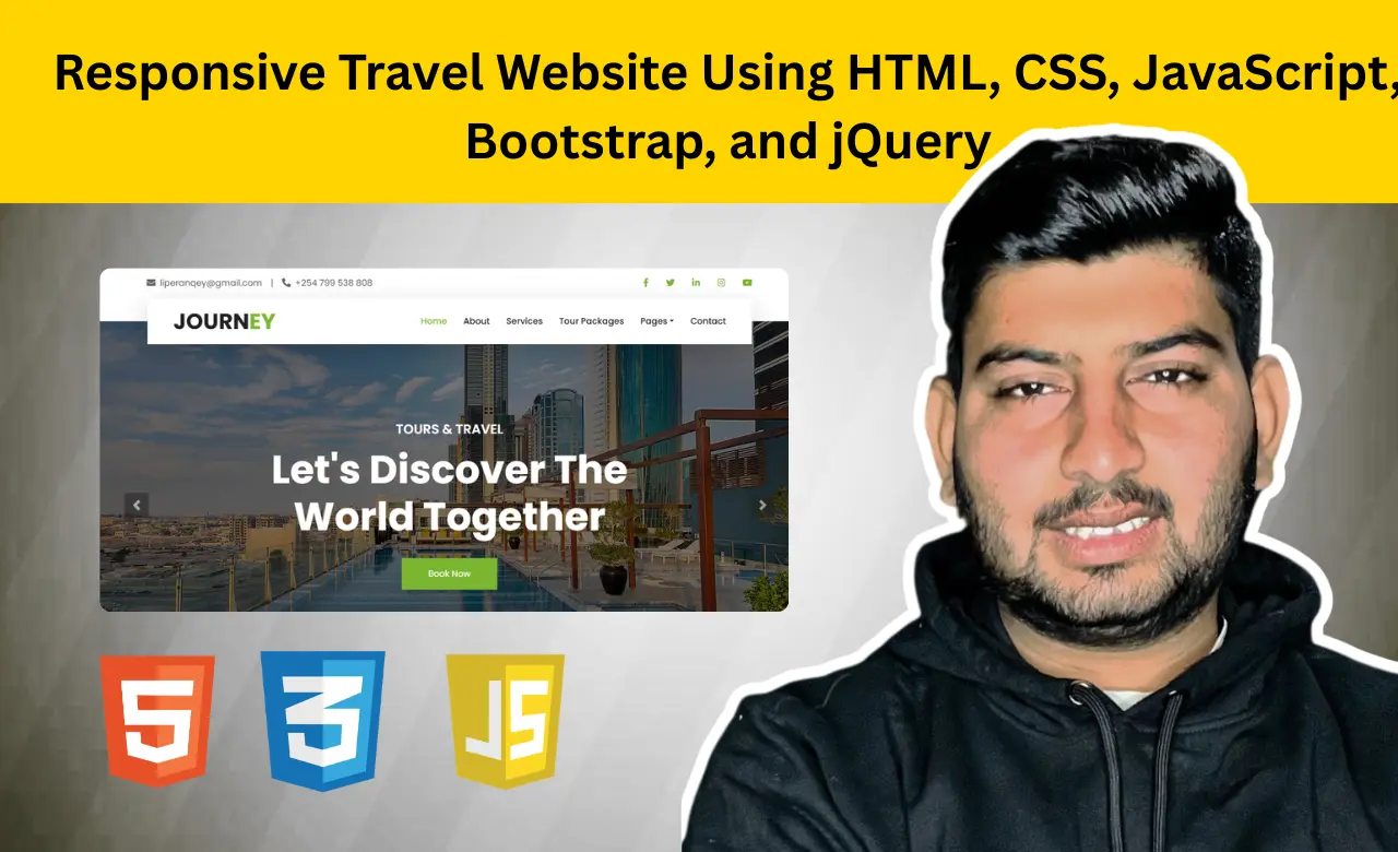
Introduction
When planning a trip, most people start by searching online for destinations, tour packages, hotels, and
travel agencies. Because of this, a professional website has become one of the most important tools for
any travel business. A well-designed travel website helps visitors explore destinations, compare
packages, read customer reviews, and quickly find the information they need.
In this tutorial,
we'll build a responsive Travel Website using HTML, CSS, JavaScript, Bootstrap, jQuery, Owl Carousel,
Tempus Dominus, and PHP. The project features a modern homepage, destination showcases, tour packages,
travel guides, testimonials, blog content, and a functional contact form. It is fully responsive and
designed to work smoothly across desktops, tablets, and smartphones.
Whether you're a beginner
looking to improve your front-end skills or a developer building portfolio projects, this travel website
is a great example of how real business websites are structured and developed.
Before diving into the code, let's explore some of the key features included in this project:
- Responsive design
- Hero carousel
- Booking section
- Destination showcase
- Tour packages
- Testimonials
- Contact form
- AJAX submission
These features combine to create a professional travel and tourism website that delivers a smooth user experience.
HTML Structure
The website uses a multi-page structure with separate pages for About, Services, Tour Packages, Blog, and Contact. This makes the website easier to navigate and manage.
The main functionality is built inside index.html, which serves as the homepage and connects visitors to all major sections of the website. The page begins with a responsive Bootstrap navigation bar that provides quick access to important pages.
<div class="navbar-nav ml-auto py-0">
    <a href="index.html" class="nav-item nav-link active">Home</a>
    <a href="about.html" class="nav-item nav-link">About</a>
    <a href="service.html" class="nav-item nav-link">Services</a>
    <a href="package.html" class="nav-item nav-link">Tour Packages</a>
    <a href="contact.html" class="nav-item nav-link">Contact</a>
</div>
This navigation menu helps visitors move between different sections of the website while maintaining a
clean and user-friendly layout.
One of the most visually appealing parts of the homepage is the
hero carousel. It displays travel-related images, promotional text, and a call-to-action button that
encourages visitors to explore destinations and book tours.
<div class="carousel-item active">
    <img class="w-100" src="pic/amenities20.jpeg" alt="Image">
    <div class="carousel-caption d-flex flex-column align-items-center justify-content-center">
        <div class="p-3" style="max-width: 900px;">
            <h4 class="text-white text-uppercase mb-md-3">Tours & Travel</h4>
            <h1 class="display-3 text-white mb-md-4">
                Let's Discover The World Together
            </h1>
            <a href="booknow.html" class="btn btn-primary py-md-3 px-md-5 mt-2">
                Book Now
            </a>
        </div>
    </div>
</div>
Instead of relying on a static banner, the carousel rotates through multiple slides, helping showcase travel experiences and promotional content in a more engaging way.
The homepage also includes a booking section where visitors can enter travel details before exploring available destinations and tour packages. This section helps users begin their travel planning directly from the homepage and acts as one of the key interactive features of the website.
<a href="booknow.html">
    <button class="btn btn-primary btn-block" type="submit"> Submit </button>
</a>
The booking form includes travel-related inputs and a submission button that redirects users to the
booking page, making the reservation process easier and more accessible.
Another major section
of the homepage is the tour package showcase. Travel packages are displayed using structured cards that
include destination information, duration, ratings, and pricing details.
<div class="package-item bg-white mb-2">
    <img class="img-fluid" src="img/package-1.jpg" alt="">
    <div class="p-4">
        <a class="h5 text-decoration-none" href="">
            Discover amazing places of the world with us
        </a>
    </div>
</div>
This card-based layout makes it easier for visitors to browse available tours and compare different travel options while maintaining a clean and professional design.
In addition to these sections, the homepage contains service information, travel guides, customer testimonials, blog content, and contact details. Bootstrap's grid system is used throughout the project to maintain proper alignment and responsiveness across desktops, tablets, and mobile devices.
By combining multiple pages with a well-structured homepage, the HTML foundation remains organized, scalable, and easy to maintain while supporting all major features of the travel website.
Visual Assets
The project uses dedicated image folders to store destination photos, package images, guide profiles, and promotional banners. These visual assets make the website more engaging and help visitors explore destinations through attractive visuals rather than plain text.
CSS Styling
After building the HTML structure, CSS is used to transform the website into a visually appealing and
interactive travel platform. The project combines Bootstrap's responsive framework with custom SCSS
styling to create a modern design that works seamlessly across desktops, tablets, and mobile devices.
Bootstrap provides the grid system, responsive layouts, and pre-built components, while custom
styles are used to personalize the website's appearance. Typography, spacing, colors, hover effects,
overlays, and animations are carefully customized to create a professional travel-themed interface.
One of the most noticeable visual enhancements can be seen in the destination section. Images
include a hover animation that creates a zoom effect when users interact with destination cards.
.destination-item:hover img {
    transform: scale(1.3);
}
This effect makes destination images more engaging and helps draw attention to featured travel locations without disrupting the overall layout. The project also improves user interaction through custom card styling. Service and package sections use hover-based shadow effects that add visual depth and make important content stand out.
.service-item:hover {
    box-shadow: 0 0 30px #CCCCCC;
}
.package-item:hover {
    box-shadow: 0 0 30px #CCCCCC;
}
These subtle animations create a more interactive browsing experience while maintaining a clean and
professional design.
Overall, the combination of Bootstrap and custom styling helps create a
responsive, visually attractive, and user-friendly travel website that delivers a consistent experience
across different screen sizes.
SCSS and Bootstrap Customization
To make the design easier to maintain and customize, the project uses SCSS along with Bootstrap. SCSS
extends traditional CSS by introducing variables and reusable styling elements, allowing developers to
manage the design more efficiently.
The website's color scheme and typography are defined using
SCSS variables at the beginning of the stylesheet.
$primary: #7AB730;
$secondary: lighten($primary, 50%);
$light: #FFFFFF;
$dark: #212121;
$font-family-sans-serif: 'Poppins', sans-serif;
These variables establish the visual identity of the website. The primary green color reflects the travel and tourism theme, while the light and dark colors provide contrast throughout different sections of the interface. By using variables, developers can update the entire website's appearance by modifying only a few values.
The navigation bar is also customized to improve usability and maintain consistent branding.
.navbar-light .navbar-nav .nav-link:hover,
.navbar-light .navbar-nav .nav-link.active {
    color: $primary;
}
This styling highlights active and hovered menu items, helping visitors identify their current location within the website and improving overall navigation.
Additional custom SCSS is used throughout the project to style page headers, booking sections, destination overlays, testimonials, blog cards, and team member profiles. Interactive hover effects, responsive adjustments, and reusable design elements work together to create a polished and professional user experience.
By combining Bootstrap's responsive framework with SCSS customization, the project achieves a unique appearance while remaining easy to maintain and scale for future enhancements.
JavaScript Functionality
While HTML provides the structure and CSS controls the appearance, JavaScript brings the website to life through interactive features. One important function manages dropdown menu behavior on larger screens.
function toggleNavbarMethod() {
    if ($(window).width() > 992) {
        $('.navbar .dropdown').on('mouseover', function () {
            $('.dropdown-toggle', this).trigger('click');
        });
    }
}
This allows dropdown menus to open on hover, creating a smoother navigation experience for desktop users. Another useful feature is the Back-to-Top button.
$(window).scroll(function () {
    if ($(this).scrollTop() > 100) {
        $('.back-to-top').fadeIn('slow');
    }
});
As visitors scroll down the page, the button appears automatically and helps them return to the top quickly. The website also uses Owl Carousel to display customer testimonials.
$(".testimonial-carousel").owlCarousel({
    autoplay: true,
    smartSpeed: 1500,
    loop: true
});
Instead of showing all reviews at once, the carousel rotates testimonials automatically, keeping the section organized and visually appealing. In addition to Owl Carousel, the project uses several jQuery plugins that improve the overall user experience.
- jQuery Easing creates smoother scrolling and animation effects.
- Tempus Dominus powers the date and time picker functionality used in the booking section.
- Owl Carousel handles testimonial sliders and carousel interactions.
These plugins provide advanced functionality while reducing the amount of custom JavaScript code required.
Contact Form Validation and AJAX Submission
One of the most practical features included in this project is the contact form system. The contact.js file validates user input before allowing the form to be submitted.
$("#contactForm input, #contactForm textarea")
    .jqBootstrapValidation({
        preventSubmit: true
    });

//After validation, form data is sent asynchronously using AJAX.

$.ajax({
    url: "contact.php",
    type: "POST"
});
Because AJAX is used, visitors can submit messages without refreshing the page, creating a smoother
experience.
Unlike many front-end tutorial projects, this website also includes a simple backend
component. The project includes a contact form that uses jQuery validation and AJAX to process user
input. Form data is sent to a PHP file for handling, demonstrating how front-end forms can communicate
with server-side scripts in a web application.
This combination of JavaScript and PHP creates a
complete contact system that can be used in real-world projects.
Conclusion
This Travel Website project demonstrates how a modern travel business can present its services through a clean, responsive, and user-friendly interface. By combining Bootstrap components, SCSS customization, JavaScript interactions, booking features, testimonials, and a functional contact form, the project provides hands-on experience with tools and techniques commonly used in professional web development.
Once you're comfortable with the existing functionality, you can customize the design, add new destinations, create dynamic package listings, or integrate a booking system to make the project even more practical. These enhancements can transform the project from a portfolio website into a fully functional travel and tourism management platform.
Source Code